1

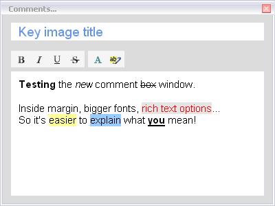
While testing for the bug m208 (Crash after about 60 comments – that I can't repro right now), it occurred to me that the comment box is really really basic.

A title line + an area to input unformatted text… You can hardly make it more minimal.

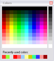
Bold, italic, underline, highlight color ? These seem pretty standard on every text box around, even on web pages.

Thoughts ?

2

Well, it really bugged me, so I went ahead and added some formatting options smile

Please welcome the new comment box:

http://www.kinovea.org/screencaps/0.8.x/commentbox.png

Also, while I was at it, I tackled an old item of the todo-list : the ugly floating color picker.
The new color picker is very much inspired from the one you can find in Greenshot. Greenshot is an awesome open source screenshot application for Windows.
The new picker has more colors, and a list of recently used ones.

http://www.kinovea.org/screencaps/0.8.x/colorpicker.png

This will be up in 0.8.9, feedback welcome big_smile

3

It has my vote! smile